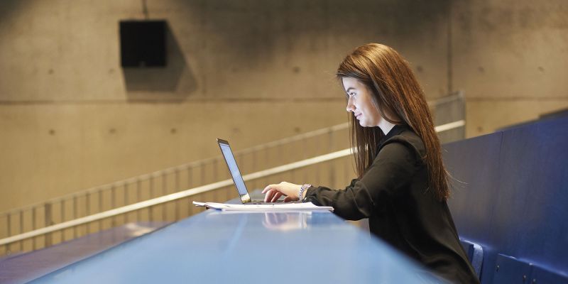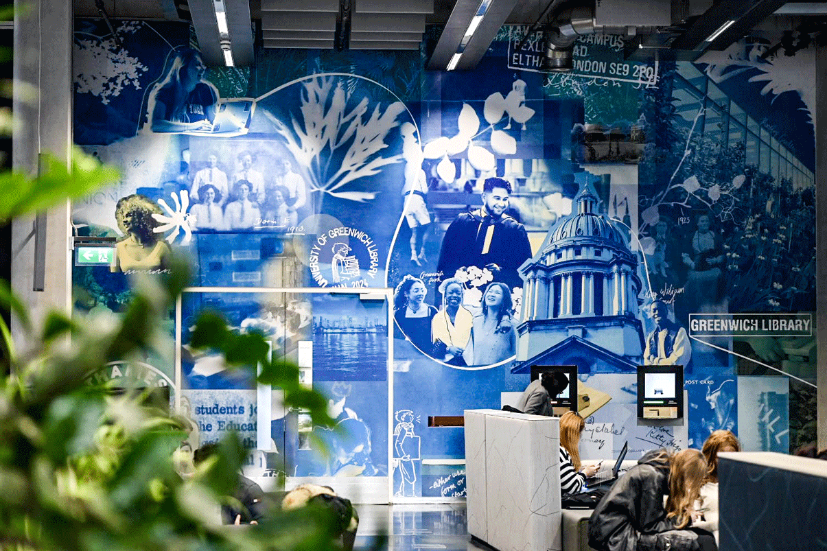
A new mural celebrates our long history of providing high-quality education to students from many walks of life and helps create a stimulating and inclusive space for students and staff.
We are University of Greenwich: past, present and future was designed by a team of students from the School of Design. It uses a 19th century method of developing photos – cyanotyping. The photos take you on a journey through time and along the River Thames – which forms an integral part of our university’s identity.
Not only has the work provided a vision of our community but our students have had an opportunity to learn new skills, preparing them for their future careers.
Clara Robson was one of the students involved in the design. She explains:
I feel really accomplished and like all our hard work has paid off. My family are super proud and mind-blown at just how huge and impactful the mural really is! I’m happy that my handwriting is included in the mural, especially next to archival handwriting from students in the 1920s, it’s a really special connection.
We decided to use photos of students from the university’s past and present. We thought it could inspire students to learn about the university’s history as we did, as well as embrace its present and future.
We took the University of Greenwich brand-colour blue as inspiration for the cyanotyping. I knew that cyanotype produced amazing rich blues and so I created an initial concept related to cyanotype as a traditional way to record architectural blueprints (linking to the architecture of our campuses as well as our popular architecture course).
I added in loads of plants as I wanted to imagine ‘blueprints for the future’, showing how society could evolve into an ecological boom.
As the concept evolved, I decided to involve the cyanotype in creating reproductions of these plants, inspired by Anna Atkins’ First book of photographs. I was then inspired by the mural I had been seeing every day: one of many artworks that forms part of Barby Asante’s Declaration of Independence. This giant photo from the TfL archive at Stratford station is a stark blue that I loved, and as it highlighted black women and their hard work contributing to TfL, I wanted to use cyanotype as well to highlight everyday, hardworking people around the university.
It was a great insight into life in the creative industry as it was quite overwhelming at first, but I learned so many technical skills from our tutors and learned just to have a go, and trust my peers who believed in my idea even when I didn’t. It was a challenging process but very rewarding.
Marc Hawkey, also a member of the student design team, said:
I love seeing the artwork installed, I think it has come out better than I anticipated. It's very bright and vibrant. I noticed how the sun reflects onto it at the top at a certain time of day – it creates some reflections and it looks like we planned it that way.
Zofia Trzaska, member of the student design team, shared:
For me, the most interesting aspect was the chance to gain new experience working on a big project and the possibility of collaborating with students from the second and third years.
With special thanks to the students who created this mural:
- Clara Robson
- Hawler Hassan
- Imola Tantrum
- Leah Macarewich
- Louis Dawn
- Kiniek Rzeszotarska
- Marian Estrada Mora
- Marc Hawkey
- Zofia Trzaska