Our digital signage is a powerful communication tool, but it’s essential to follow proper design and content guidelines for best results.
Here's everything you need to know to create clear, impactful and on-brand digital signage for the University of Greenwich.
Templates and branding
We provide a range of digital signage templates created in PowerPoint. Just choose the one you need, then add your text and images to create your own, on-brand digital artwork.
Each of the templates includes a correctly positioned University of Greenwich logo. Please don’t add further versions of the logo to your artwork.
You can download our digital signage templates from our internal brand toolkit.
To bring visual impact to your artwork, check out the image libraries on the toolkit and Brand Centre. If you don’t have access to Brand Centre, please see our brand and content page for more information.
Specifications
When creating the artwork for your digital signage, please ensure that you follow the specifications set out below.
Core content
There is limited space on a digital screen, so focus first on including the most important details. These are:
- Title (of the event, for instance)
- Short description – maximum 40 words
- Date and time
- Location
- URL
- What the viewer should do next (this is the most important part).
Dimensions
- For information on sizing artwork for our digital screens, see our page on image sizes.
Contrast and legibility
- Don’t run text directly over an image unless the copy is easily readable
- To ensure your text is legible and accessible over a background colour, use one of our recommended text and background colour combinations – see pages 55 to 59 of our brand identity guidelines.
Timings
As our audience is on the move and may view the content from a distance, you only have moments to get your message across. You have:
- 1 second to capture their attention – so use an impactful, colourful image
- 10 seconds to display the text before it’s replaced by the next slide – so keep the copy short and easy to read
- 30 seconds for their attention to be focused on a video – after that, they’re likely to drift away.
Copyright
- Do not use copyrighted images or text without permission or license
- All copyright and trademark laws must be adhered to
- Whether you are commissioning artwork for digital signage or creating it yourself, you are responsible for providing documentary proof of permission to use copyrighted content.
- If you’re unsure, see our copyright advice here.
Templates
- If you create your own design template from your artwork, you can use it to give your future digital signage jobs a consistent look.
Audio
- Our digital signage screens don’t have audio.
Captioning and accessibility
- Any video content should must include captions
- For guidance on making content accessible, visit our webpage on creating accessible media.
QR codes
- Don't use a QR code as the only way to take the viewer to additional information – always provide a URL
- Use the Adobe QR code generator to create a QR code
- QR codes should only be generated using Adobe InDesign or Adobe Express as licensed by the university – do not use third-party external software
- Check the generated code complies with our brand guidelines regarding colour contrast.
Text and typography
- Use italics sparingly, as they can be hard to read from a distance
- Include a double space between paragraphs
- Use our core typeface Cooper Hewitt, plus Public Sans for sub-headings and body copy. Both can be downloaded from our internal brand toolkit. If you have any problems using these fonts on your computer, you can use Aptos instead.
Unacceptable content
- Insulting and derogatory comments, and personal attacks on individuals or groups
- Inappropriate material or material promoting illegal activities, including, but not limited to, pornography (including child pornography), obscene matter, race hate material, messages condoning violence or drug use
- Commercial advertising, or promotion of alcohol or tobacco
- Copyright material (both images and text) without permission of the copyright owner
- Personal information without consent
- Other confidential information, or information which is commercially sensitive to the university
- Content that may cause damage to the reputation of the university
- In addition, the use of clipart is strongly discouraged.
Putting our guidance into practice
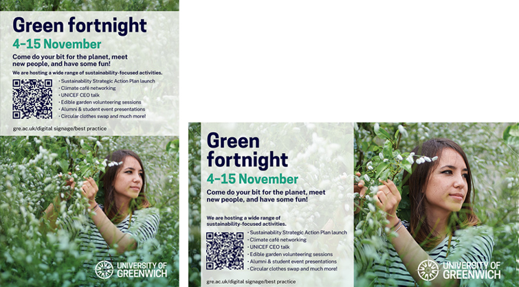
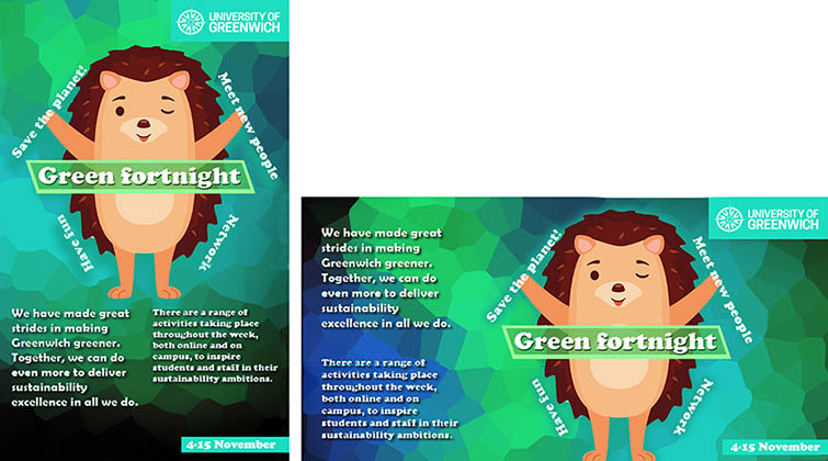
Here are some examples of effective digital signage to give you a sense of what your own artwork could look like. You’ll also find some less successful signage that we’ve created especially as an object lesson on what not to do.
Good
- The design is on brand
- The image piques interest and is relatable
- The text is concise, providing the essential information
- The language addresses the viewer directly, putting them right at the heart of the message
- The viewer is encouraged to approach and interact with the artwork in order to scan the QR code
- The web address and QR code are readable and accessible, so the viewer knows what to do next.

Bad
- The design is off brand – for instance, the colours and fonts are wrong
- Logo is placed too close to the edge of the screen
- The artwork is not accessible – some text is upside down, for example
- The image is unattractive and unengaging
- There’s no call to action to indicate what the viewer should do next
- The design is cluttered with too much information.

(Simulated example generated in pch.vector)